The Living Colors
of Art History

From earth pigments of the Paleolithic to the synthetic palette of Modernism — explore how color shaped every era of human artistic expression.

Explore
01 — Era Palettes

Colors Through the Ages

Each artistic movement developed its own chromatic vocabulary — dictated by available pigments, philosophical beliefs, and the desire to evoke particular emotions.

Prehistoric Art
c. 40,000 – 3,000 BCE

Painted with what the earth offered — iron-rich ochre, manganese dioxide, charred bone, and animal fat as binder. The caves of Lascaux and Altamira glow with a warmth undiminished by millennia.

Red Ochre Charcoal Hematite Yellow Ochre Kaolin White
Ancient Egypt
c. 3,100 – 30 BCE

The first synthetic pigment — Egyptian Blue (CaCuSi₂O₆) — was engineered around 2,500 BCE. Color was symbolic: red meant life and victory; green renewal; black the fertile Nile silt.

Egyptian Blue Malachite Orpiment Realgar Red Huntite White
Byzantine Art
c. 330 – 1453 CE

Gold dominated — not as decoration but as sacred light made material. Tyrian Purple, extracted from murex snails (10,000 snails per gram), was reserved for emperors and the divine. Color was theology.

Tyrian Purple Gold Lapis Blue Vermilion Verdigris
Italian Renaissance
c. 1400 – 1600 CE

Ultramarine from Afghan lapis lazuli cost more than gold — only the Virgin Mary's robes warranted it. Leonardo's sfumato blended colors into imperceptible tonal transitions, mirroring the softness of nature itself.

Ultramarine Vermilion Lead White Raw Umber Naples Yellow
Baroque
c. 1600 – 1750 CE

Caravaggio's chiaroscuro demanded extreme contrast: near-black shadows against brilliant illuminated flesh. Rembrandt layered warm glazes over dark grounds to achieve his luminous, amber-drenched interiors.

Bone Black Burnt Sienna Yellow Lake Bitumen Lead White
Impressionism
c. 1860 – 1890 CE

The Industrial Revolution unleashed dozens of new synthetic pigments. Monet and Renoir embraced cobalt blue, chrome yellow, and viridian — applied in loose, broken strokes to capture transient light, not fixed form.

Cerulean Chrome Yellow Rose Madder Viridian Cadmium Orange
Post-Impressionism
c. 1886 – 1910 CE

Van Gogh's cobalt blues and cadmium yellows swirled with emotional urgency. Gauguin fled to Tahiti for intense tropical hues. Cézanne built form with carefully modulated planes of color rather than line.

Prussian Blue Cadmium Yellow Vermilion Mauve Emerald
Fauvism
c. 1905 – 1910 CE

Matisse, Derain, and Vlaminck unleashed color from its descriptive role. Grass could be purple; shadows could be red. Critics called them "les fauves" — wild beasts — for their savage, unmodulated chromatic freedom.

Pure Red Pure Orange Cerulean Pure Green Magenta
Abstract Expressionism
c. 1943 – 1965 CE

Rothko dissolved color into atmospheric fields of pure emotion. Pollock's drip paintings created webs of interlocking tones. Color was no longer about representing the world — it was the world, raw and immediate.

Deep Crimson Near Black Raw Umber Deep Blue Off White

Principles of the Palette

The theoretical underpinnings that guided how artists mixed, applied, and understood color across centuries.

Simultaneous Contrast

Chevreul (1839) discovered that adjacent colors mutually intensify each other. A red patch appears more vivid next to green than next to orange — a phenomenon the Impressionists exploited by placing complementary colors side by side.

Chiaroscuro

The Italian term for light-dark, this technique modeled three-dimensional form through tonal gradation. Leonardo, Caravaggio, and Rembrandt each used it differently — from gentle sfumato to violent tenebrism to warm, golden pools of lamplight.

Optical Mixing

Seurat's Pointillism placed pure, unmixed dots of color onto the canvas, trusting the viewer's eye to blend them at a distance. He believed optical mixing produced more luminous results than physical mixing on the palette.

Color Symbolism

Across cultures, color carried meaning: Egyptian green was resurrection; Byzantine gold was divinity; medieval blue was the Virgin Mary's purity; Romantic red evoked passion and revolution; Modernist black the void of the unconscious.

Complementary Harmony

Colors opposite on the wheel — red/green, blue/orange, violet/yellow — create visual tension and maximum contrast. Delacroix used this systematically in the 1830s, and Van Gogh later pushed complementary pairs to near-violent intensity.

Tonal Value

Before modern color theory, painters organized compositions primarily by light and dark — value — rather than hue. A painting that "works" in black-and-white has strong tonal structure. The Old Masters often underpainted in gray monochrome first.

03 — Pigment History

When Colors Were Born

The discovery or synthesis of each pigment fundamentally altered what painters could do. Here are the pivotal moments.

c. 40,000 BCE
Red & Yellow Ochre

Iron oxide pigments, ground from naturally occurring minerals, gave Paleolithic artists the first reliable earth colors. Ochre's chemical stability means cave paintings retain their warmth after 40,000 years.

c. 2,500 BCE
Egyptian Blue — First Synthetic Pigment

CaCuSi₂O₆, made by heating limestone, quartz, and copper minerals, this vivid cyan-blue was the world's first manufactured pigment. It required temperatures of 900°C — testament to Egyptian technological sophistication.

c. 1,200 BCE
Tyrian Purple

Extracted from the mucus of Bolinus brandaris snails on the Lebanese coast, this purple was so costly it became a symbol of supreme authority. Roman emperors wore it; Byzantine manuscripts were written on purple-dyed vellum.

c. 1 CE
Vermilion (Cinnabar)

Mercury sulfide, ground from cinnabar ore, produced the most brilliant red available for over 1,500 years. Used in Roman murals, medieval manuscripts, Chinese lacquerware, and Renaissance altarpieces — though slow exposure could cause mercury poisoning.

c. 1,100 CE
Ultramarine from Lapis Lazuli

Ground from lazurite-rich rock mined only in Badakhshan, Afghanistan, ultramarine was the most expensive pigment in Europe — reserved for only the most sacred subjects. A commission specifying "the finest ultramarine for the Virgin's mantle" was a statement of supreme devotion.

1704
Prussian Blue — First Modern Synthetic

Accidentally discovered by colormaker Johann Jacob Diesbach in Berlin, Prussian Blue (ferric ferrocyanide) was the first synthetic pigment of the modern era — affordable, stable, and intensely dark. Hokusai's "Great Wave" owes its haunting depth to Prussian Blue.

1826
Synthetic Ultramarine

Guimet and Gmelin independently synthesized ultramarine from kaolin, silica, and sulfur. For the first time, the most coveted blue in history became democratically available, transforming what ordinary painters could afford.

1856
Synthetic Organic Dyes — Mauveine

William Henry Perkin's accidental discovery of mauveine (mauve) while attempting to synthesize quinine launched the modern synthetic dye industry. Within decades, hundreds of new pigments flooded the market — the direct fuel of Impressionism and everything that followed.

1953
Phthalo Colors & Modern Pigments

Phthalocyanine pigments — intensely saturated, extraordinarily lightfast, and inexpensive — became the workhorse blues and greens of modern art. Yves Klein used a modified ultramarine binder to create "International Klein Blue," patented as IKB in 1960.

04 — Notable Palettes

Iconic Color Studies

Specific masterworks whose chromatic choices defined a movement, shocked audiences, or permanently changed how artists thought about color.

Mona Lisa by Leonardo da Vinci, c. 1503
Louvre Museum, Paris · Public Domain
Leonardo da Vinci · c. 1503
Mona Lisa

Built on a warm brown imprimatura, Leonardo used lead white, vermilion, verdigris, and ultramarine with imperceptible tonal transitions. The sky shifts from warmer to cooler as it recedes — aerial perspective rendered entirely in color temperature.

The Starry Night by Vincent van Gogh, 1889
Museum of Modern Art, New York · Public Domain
Vincent van Gogh · 1889
The Starry Night

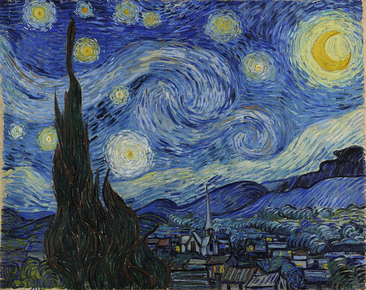
Prussian blue and cobalt swirl in agitated impasto against cadmium yellow halos. Van Gogh wrote to Theo of expressing "the terrible passions of humanity by means of red and green." The complementary tensions create unbearable luminous energy.

Composition II in Red, Blue, and Yellow by Piet Mondrian, 1930
Kunsthaus Zürich · Public Domain
Piet Mondrian · 1930
Composition II in Red, Blue, and Yellow

Pure primary colors — red, blue, yellow — separated by black lines against white. Mondrian believed these three contained all others implicitly. His palette was a philosophical argument: reduce the visible world to its irreducible chromatic essence.

Tate Modern, London · Chromatic Reference
Mark Rothko · 1958–59
The Seagram Murals

Deep crimson, maroon, and near-black rectangles float on dark grounds. Rothko layered ultra-thin washes to make color breathe. He said he intended these paintings to provoke the feeling of a chapel — or of tragedy made visible. The commission was ultimately refused; Rothko donated them to the Tate.

The Night Watch by Rembrandt van Rijn, 1642
Rijksmuseum, Amsterdam · Public Domain
Rembrandt van Rijn · 1642
The Night Watch

Lead white, smalt, natural ultramarine, and bone black built a world of dramatic emergence from near-total darkness. The yellow-clad girl glowing like a lantern against shadow demonstrates Rembrandt's mastery of selective chromatic illumination.

Woman with a Hat by Henri Matisse, 1905
San Francisco Museum of Modern Art · Public Domain
Henri Matisse · 1905
Woman with a Hat

The portrait that crystallized Fauvism: a face rendered in green and red, hair in blue and orange, background a swirling chaos of non-naturalistic pigment. Critic Louis Vauxcelles called it a "pot of paint flung in the public's face." Matisse considered it a liberation.